Manage Content Instead of Design
A well-designed site built into a content management system will make your site easy to maintain, right? Well, maybe not. It’s not just having a CMS, but how the system is set up to manage your content that can really make the difference.
Don’t WYSIWYG Out
WYSIWYG (What You See Is What You Get) editors help keep your website content managers from having to dig directly into the HTML that makes up your content. They let admins do things like insert their cursor and place an image, or highlight an item and create a hyperlink. For writing page content, blog posts, and so forth, they streamline the process of adding new material to your site, or updating what you already have.
However, you can run into challenges when the content has an embedded layout that goes with it. If it isn’t just paragraphs of text, a few subheads, and a sprinkling of photos/diagrams/etc that go into the text to illustrate your points, you may find yourself managing layout when what you should really be doing is managing content. If your WYSIWYG editor window has you working on a lot of composite content chunks that require specific placement/styling for a number of the items, and you find yourself having to be careful that you don’t break the layout as you edit things, you know what I’m talking about.
Ideally, content and presentation should be largely separated. Someone editing content should be thinking about what the content is and what it means, not what it should look like. This is thinking semantically instead of presentationally. What is something? A sub-point, part of a feature list, part of a photo gallery? You as editor should focus on telling the system what things are. The design (as implemented in your CMS) should concern itself with how these things are supposed to look.
Totally Granular, Man
I wrote previously about a basic way in which limiting the controls in a WYSIWYG editor helps to preserve your visual brand. Today, we talk about a granular approach to your content that helps you avoid having to wrangle delicate designs in a WYSIWYG window.
Let’s walk through an example Hexatrope built for a catalog of student housing rental properties. Because these pages were specially designed to present detailed information, the interface was created with a layout that went beyond just a simple column of text.
This is the core content area on a page that is part of a site promoting student housing.

One way of setting up the management of a page like this is to place all of that content into a single container for editing. Want to change something? Go into that single container and use your WYSIWYG editor to change what’s in there.
This image shows all of the content and layout configured into a single WYSIWYG window. The middle pricing line is highlighted for editing.

Because this blends content and layout inside your editor, whoever goes in to work on the content has to be careful that they don’t accidentally break the design. An extra carriage return, incorrect styling (was that bold, italic, or normal?), a deletion of the wrong element… the challenges can be many. Blowing the styling or layout on any of the items on this page through a hiccuped edit would be pretty easy. I know, because back in the day, clients edited their sites via Dremweaver, and they broke design all the time.
Everything in Its Place
The other approach is to look at the requirements of the page, and separate the content from the presentation by creating individual content containers for each item – and having admins input/edit just the data, with no presentational information.
Address & Description
The address and description are core pieces of information that are in different places on the layout, but are placed together on the edit page.

Availability & Floorplan
The Availability field drives baked-in logic that switches the property between “available” (where you are presented with a link to book a showing), “pending” (where you are linked to put your name on a waiting list), and “taken” where the property is unavailable. In a WYSIWYG approach, you’d be stuck manually copying and pasting different linked graphics into the layout to change the status. With the granular approach, the system looks at the number (year) you entered and does it for you automatically.
The floorplan image and pdf are combined on the front end to link a preview image with a download. No messing with tucking the image in the correct spot and linking it. Just pick the right files, and you’re done.

Name Your Price
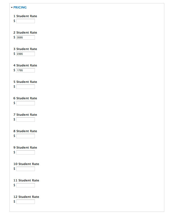
The layout lists the per-student rent at different occupancy levels. You could edit that list manually inside the layout, or you could just punch numbers into a few fields and let the system handle it for you. If you've ever edited a list like this manually, you know that having more or fewer items can be a real pain to do.

The Image Gallery
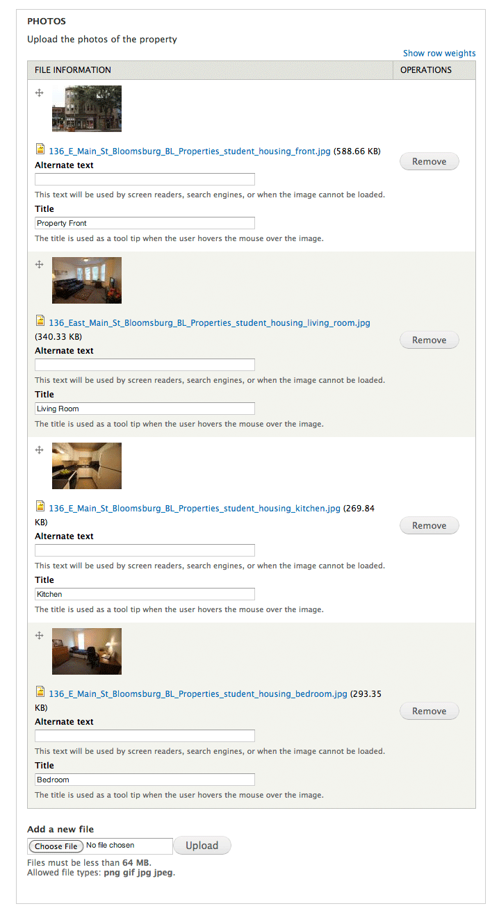
The square photo “thumbnails” pop up full size photos in an overlay when clicked. You could manage this by carefully copying and pasting markup, making sure all the HTML has the correct parameters… or you could just use a form to upload images, then name and re-order them by dragging and dropping items in the admin interface where there is no HTML to accidentally mangle.

Tell Me All About It
Instead of trying to add, edit, and remove items from a WYSIWYG list (Key Property Features & Additional Features in the core content shown above), you can simply pop in data for each item, and check/uncheck others for inclusion. Note also that the dropdown picklists and checkboxes offer set options, which completely avoids the issue of different admins typing in similar but different terminology and potentially creating confusion.

Use It Wisely
As with anything, experienced judgment about which items to make granular and which not to is important. You don’t want to overdo it and over-automate things. But when handling components that use layout to harmonize the presentation of a number of disparate chunks of information, it makes a lot of sense because it makes your management process faster and easier, and keeps your information’s presentation intact.